About The Rebrand
Why The Future Is Flying
On June 11th, 1976, the Edmonton Oil Kings found their new home in Portland, OR. Renaming themselves to the Winterhawks, the team obtained jerseys from the Chicago Blackhawks, who had a surplus of them, leading many to believe the Winterhawks were a farm team within their organization. In actuality, the Winterhawks jerseys (and subsequent given logo) was a product of a connection between the owners of the two teams, and does not actually tell the story of the Portland Winterhawks, the region they reside in, or the vibrant community supporting them.
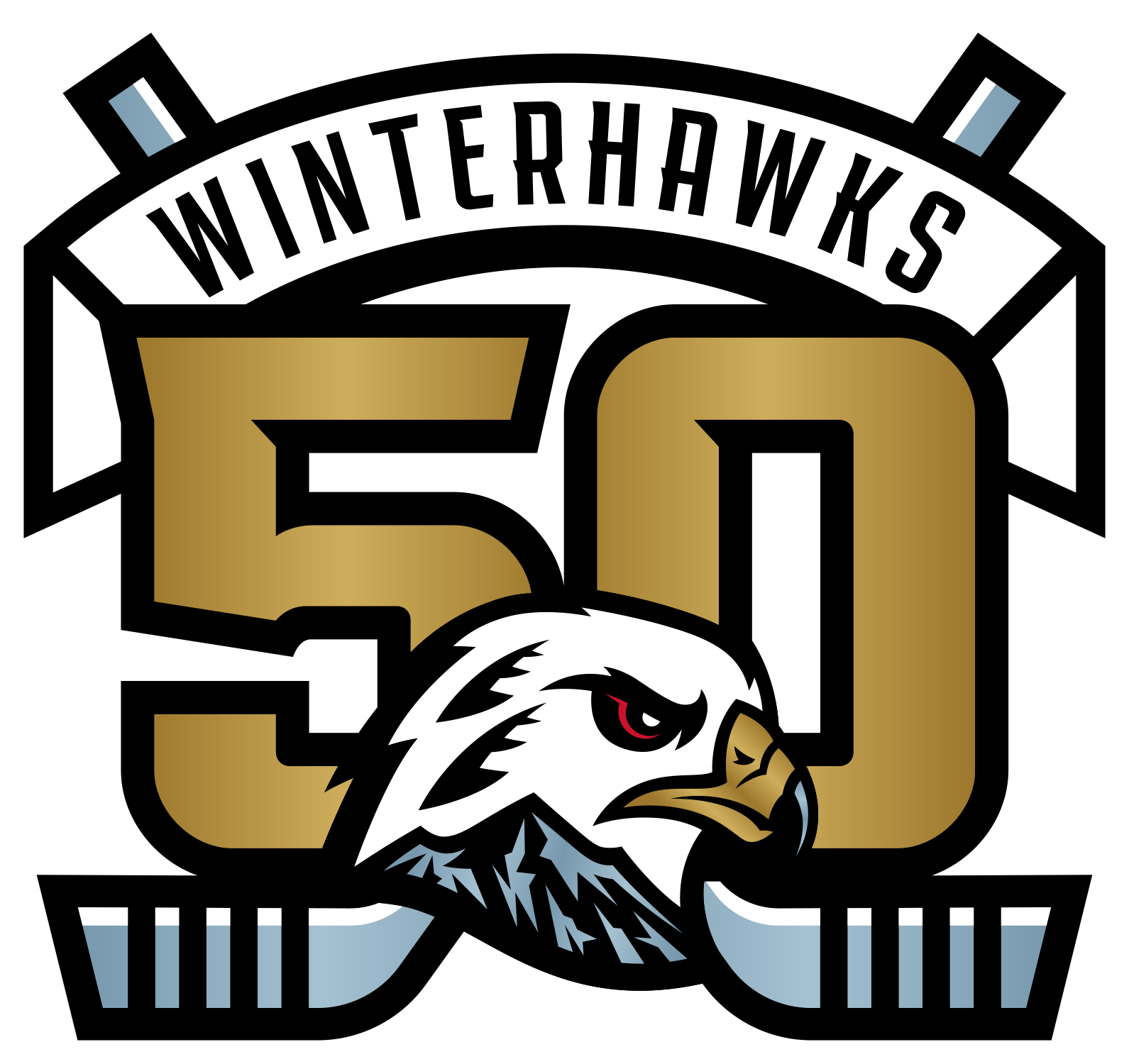
The rebrand and new identity Portland Gear created for to the Winterhawks was derived out the necessity for better and more accurate storytelling.
- We replaced the previous logo with a fierce hawk, reflective of our players’ style and poise on the rink, and highlighted the bird’s feathers - an ode to the logo’s previous identity
- We’ve added Mt. Hood, Portland’s presiding mountain connecting the hawk to the idea and essence of “winter”. The mountain is detailed with a hidden “WH” found in the snow.
- We’ve defined a new colorway - adding “Squall Grey”, further connecting the team to the Pacific Northwest.
We’re so thankful to have such a supportive hockey community to help our new identity be seen, and we’re excited to helm the forefront of the future of Portland Hockey.
We are The Portland Winterhawks - the future flies.
We are The Portland Winterhawks - the future flies.

